
What about colour in architecture? Look around, and the long history of muted colours in Canadian architecture becomes apparent. This means that, collectively and individually, we have accepted such buildings as the norm, while, over the decades, we have experimented with interior colours. There is sound logic why this has unfolded in this way, but as new materials become available offering wide palettes of colour, we might expect a more vibrant architecture to appear – or will it?
Research into colour goes back over two centuries, although, as with many fields, practical experimentation was rare, so the analysis of individual personal opinion was usual. For example, Goethe in his Theory of Colours of 1810 analysed his own personal responses, with different colours seen as relating to his own specific feelings. That is how he saw it – but were his specific perceptions and associations widely held (one suspects not)? The notion of colours being related to moods has persisted, and remains a part of our everyday language – green with envy, red with rage, and blue with depression. Indeed, we end to like colours that relate to pleasant things – blue skies and lakes, but brown with dirt and corruption.
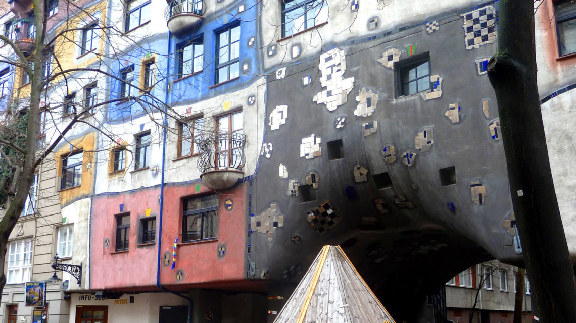
c.000P1060387
Hundertwasserhaus, Vienna: Colourful, but depends on periodic repainting – the photograph was retouched to remove dirt streaks.
More recently, more sophisticated research has been undertaken, however the results have often been ambiguous, and that probably relates to context, and in architecture, colour always appears in a context. What might be preferred in a building interior – perhaps some office space – might not be appreciated on a building exterior, let alone in a controlled academic experiment. Robert Finlay, writing in the Journal of World History, commented on the complexity of this matter: “In short, humans respond to color more on the basis of subliminal emotion than on grounds of rational consideration.”[1] It is challenging to even consider whether one brain mediates colour stimuli the same way that another does. Do all people, for example, experience sky blue in the same way? While we might agree on what sky blue is, we may experience different reactions to it. Exploration of brain processes and how they form responses to colour is now underway using fMRI (functional magnetic resonance imaging), and we might expect new insights resulting from those efforts.[2]
We know that familiarity is one of the key determinants of how we assess building exteriors.[3] Bauhaus architect Walter Gropius expressed it as “We do not get our sensations from things around us but the sensations come from us. Since they do not come from the immediate environment (the present) and obviously cannot come from the future, they come from the past. If they come from the past they must be based on experience.”[4] Essentially, we become attuned to what we know, and tend to see what we know as not just the normal state of affairs – but we also tend to prefer that state, perhaps because the familiar is usually also non-threatening, as we have had experience with it and know what it means.
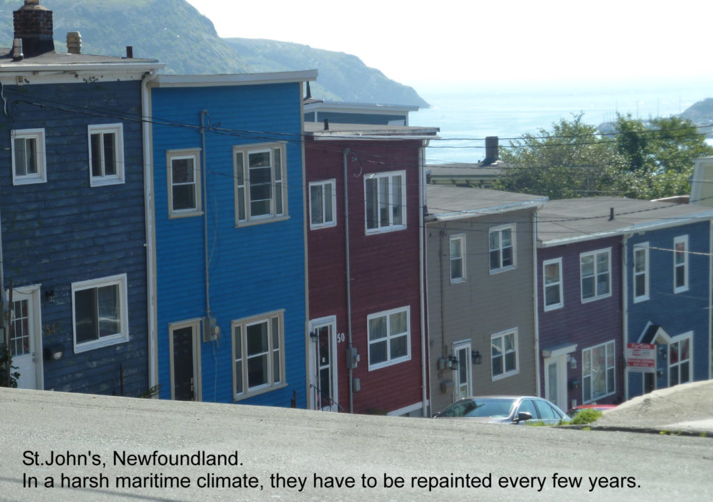
Of course, there are rational reasons why we tend to build using muted colours, thereby starting off a cycle of familiarity, and that has to do with durability. Exterior environments, especially in places with extreme and varying conditions such as found in Canada, are hard on building materials. It is often wise to select materials that do not suffer from obvious fading – such as brick, stone, terracotta, cementitious rendering, concrete, concrete block or, in drier locations, even mud brick. These give a range of greys, beiges and earth-toned colours. This tends to colour our cities in those tones. Exceptions do exist, such as in maritime climates. One might think of St. John’s, Newfoundland, where exteriors are sometimes painted in vivid colours, but traditional buildings tend to be wood-clad, and have to be painted periodically anyway – the colour decision is revisited whenever the building requires repainting. Historically, we know that the ancients often did paint their monumental buildings, sometimes with multi-coloured images, but over the centuries, the colours have faded or fallen off – so we have become familiar with them in their ‘natural’ state. When we attempt to reproduce them, or are inspired by them, we rarely include their original colours.
P.224-StJohns-1050751
Colour in traditional buildings in St.John’s, Newfoundland.
Building exteriors are usually long-lived, in contrast to many aspects of interiors, which are usually easier to change in response to fashion. But the use of applied colour offers possibilities, as properly used it might offer the option of future colour change at relatively low cost. How this might be done is obviously subject to ongoing development of systems and materials.
What do we know about colour preferences?
In the early twenty-first century, the empirical research on exterior building colour remains quite limited, with strands being variously speculative, physical, physiological, cultural, psychological, artistic and even spiritual – many colours are associated with many religious occasions and meanings. It is possible to imagine some comprehensive formula that integrates all aspects of the architect’s design issues, but such might be forever elusive, in particular as preferences are subject to ongoing change, and individual design matters, such as colour are not independent of other building elements.
Looking more specifically into architectural discussion of colour, one still finds a great deal of personal opinion, and quotes of previous personal opinions, as was considered by Swedes Gert Marcus and Hans Matell.[5] This is, at least in part, a reaction to the complexity of scientific colour research, which has diverged from the opinions and concepts of the creative community.
Colour and culture was explored by Robert Finlay of the University of Arkansas, who noted that over the past few centuries, in numerous Eurasian societies, bright colours were a marker of lower social class – people of taste did not display bright colours, which were often seen as “… superficial, subjective, irrational, self-indulgent, sensual, disorderly, and deceptive”[6], but offered only limited insights into why this might be the case.[7] He underlined that different cultures relate to colour differently, in keeping with differing historical, political, economic and religious conditions, and the availability and cost of different pigments. Martosenjoyo proposes that “Until the late 19th century there was a view that bright colors aimed at attracting attention were considered inappropriate and should be used sparingly.”[8] Research undertaken since the 1960s has indicated that too many different colours (as well as materials) can decrease the esteem given to a design – because excessive complexity decreases legibility.[9],[10],[11]
Stylistically, there has been a wide acceptance, at least in western culture, of white-dominated design, at least in part, inspired by early twentieth century architectural theory and buildings, and perhaps an appreciation of settings that are seen as clean. Examples abound in the advertisements of real estate agents and in the design of many new car dealerships. Similarly, for decades through the twentieth century, magazine photography was in black and white, again creating familiarity with that form of building representation, and, presumably, encouraging designs that were best photographed that way.
THE FUTURE – HOW DO WE INTEGRATE MORE COLOUR INTO BUILDINGS?
Colour is one of the tools available to the building designer or manager to manipulate building exteriors, and, in other countries, increasing use of colour can be seen. Quite apart from preferences, there is evidence that the use of colour, art and ornamentation can change the perception of space and form,[12] often at lower cost than physical manipulation of form of the fundamental building materials.
P1100950Bud-Wall-S
Wall mural in Budapest: Adding variety to a city by disguising the end wall of a building.
If colour can help the designer in creating esteemed, and hence better-performing buildings, the question arises about how to accomplish that. The Victorians, in rediscovering and redefining the medieval past, were not ashamed of using colour, both inside and outside. Some buildings, such as those designed by William Butterfield (1814–1900), used brick and ceramic colours and patterns extensively and architecturally – perhaps even riotously[13.] In other settings, iron structures and materials were sometimes defined with contrasting colours. However, in early functionalist modernism, colour, like ornament, was often seen to be superfluous, and white walls were the ideal[14]. This can be understood as a reaction to the worst of the industrial revolution cities, where rapid growth was associated with filth and squalor. The appeal of clinically white buildings is obvious in such a context.
As the twenty-first century advances, we are likely to see new possibilities offering colour opportunities not available previously. Long-lived colours and patterns, on durable materials, are increasingly available. As they are used, it is likely that increasing familiarity with more dramatically coloured buildings will make them more acceptable and desirable.
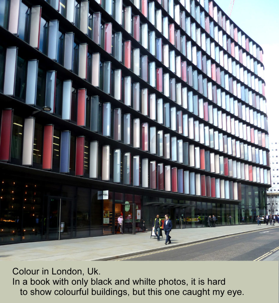
P.225-ColourLondon1060457
A recent building in London, UK, using more recent materials in an interesting way.
However, the practical designer or manager should consider the reasons why exterior building colour should be treated cautiously, at least for the foreseeable future. Building exteriors can be very long-lived – longer than fashion trends – remember that clothing manufacturers and fabric suppliers plan colours on a year-by-year basis. This suggests that transient building elements might be treated differently than the permanent elements. Many, perhaps most, interiors can be redecorated relatively easily in keeping with the most recent trends, while exteriors potentially have to exist for decades or centuries, and should not look excessively dated or strange until they become esteemed simply for their age. This suggests that exterior elements that are periodically renewed might be considered for more aggressive colours. The logical extension is that buildings might be designed so some exterior elements might be more readily renewed – effectively planning for periodic updating in accordance with future preferences. Although that implies future cost, it might also might mean lower initial cost – things that might be mathematically assessed and balanced. Of course, this must be carefully thought through, in terms of what is actually easy to change. A curtainwall manufacturer recently discussed the complexities of changing now-unfashionable mullion colours on buildings a couple of decades old. Consideration of such a detail at the design stage would have made the building exterior more adaptable to fashion imperatives – presumably better retaining value in the marketplace.
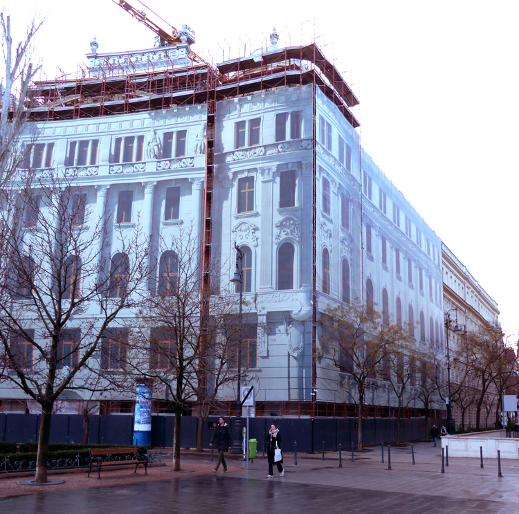
P1100978Bud-BldgCovered-S
A building being renovated in Budapest: The scaffolding is covered with an image of the building beneath. Worth thinking about?
Ultimately, one might consider the possibility of replaceable building facades – enabling the architect to be more aggressive with colour, knowing that the initial choice is not a ‘forever’ decision. Of course, there are questions about how to implement this, but the images used on scaffolding covers do hint at such possibilities.
In the twenty-first century, new materials offer colour opportunities not available previously. Dramatic and long-lived colours and patterns are more available. Moreover, it might be suggested that there has been an increase in societal diversity, allowing more expressions of individuality. It is an interesting challenge for architects, planners and developers to address.
NOTES:
[1] Finlay (2007), p.394.
[2] Racey et al (2019)
[3] Bohrn et al (2013)
[4] Gropius (1943/1970) p.31.
[5] Marcus and Matell (1979)
[6] Finlay, 2018, p.20.
[7] Part of the article on which this is based was written in the Starbucks in First Canadian Place in Toronto, where the presumably affluent and high-status individuals exhibit few bright colours. One can observe a few women wearing bright yellow or red coats. One might wonder if they are senior bankers or the receptionists.
[8] Martosenjoyo (2021) p.88-89.
[9] Kaplan and Kaplan, 1983, p.18.
[10] Kumar and Garg, 2010, p.487.
[11] Stamps, 2004, p.2.
[12] Braham, 2001, p.195.
[13] All Saints, St Margaret Street, in London, is one example and worth visiting.
[14] Braham, 2001, p.193.
SOURCES
Bohrn, Isabel, et al. (2013) ‘When we like what we know: A parametric fMRI analysis of beauty and familiarity’, Brain & Language, 124, pp.1-8.
Braham, William W. (2001) ‘Solidity of the Mask: Color Contrasts in Modern Architecture’. Anthropology and Aesthetics, No. 39 (Spring, 2001), pp. 192-214.
Finlay, Robert. ‘Weaving the Rainbow: Visions of Color in World History’, Journal of World History, Vol.18, No.4, (2007), pp. 383-431.
Gropius, Walter (1943/1970) The Scope of Total Architecture. New York, Collins-Macmillan, p.31.
Kaplan, Stephen and Kaplan, Rachel: (1983) Cognition and Environment: Functioning in an Uncertain World, Ann Arbour: Ulrich’s Books.
Kumar, Minu and Garg, Nitike (2010) ‘Aesthetic principles and cognitive emotion appraisals: How much of the beauty lies in the eye of the beholder?’ Journal of Consumer Psychology, 20, pp.485-494.
Marcus, Gert and Matell, Hans, (1979) ‘Colors on the Exterior Walls of the Buildings of the Apartment Complex at Västra Flemingsberg, Huddinge, Sweden’, Leonardo, Vol. 12, No. 2 (Spring, 1979), pp. 89-93.
Martosenjoyo, Triyatni, (2021) ‘Color in Architecture: Before and After Industry Revolution’, Journal of Social and Political Sciences, Vol.4, No. 4 pp.87-94.
Racey, Chris; Franklin, Anna; Bird, Chris M. (2019) ‘The processing of color preference in the brain’, NeuroImage. Vol.191, pp.529-536. preprint downloaded from bioRxiv, 12 April, 2019.
Stamps, Arthur E. III (2004) ‘Mystery, complexity, legibility and coherence: A meta-analysis’. Journal of Environmental Psychology, 24, pp.1-16.